
This was a huge project, with so many moving parts. We are deeply grateful for Digital Pulp’s vision (and helping us to define ours), their professionalism, good humor, and true commitment. Not only is it a stunning design, but it’s working hard and driving interest. Events registrations from the website alone are up 40%! Truly, we could not be more excited!
Boosting Gravitas at CIIS

- Brand Consultation
- Brand Application
- Visual Identity
- Information Architecture
- Content Strategy
- UX & UI Design
- Content Development
- Web Development
Amid America’s ongoing cultural reckoning, the California Institute of Integral Studies is more relevant than ever with its focus on cross-cultural understanding, mental and spiritual wellness, and social justice. Unfortunately CIIS’s old website failed to reflect the institution’s gravitas. The design was dated, the navigation was confusing, and the site copy was vague and overly esoteric.
Digital Pulp’s redesign positions the school as a respected academic institution while still balancing CIIS’s transcendental roots in consciousness and transformative integral education.
Ancient Can Be Modern
 Part of the early redesign effort was to help CIIS develop and apply their fledgling brand identity. We workshopped their logo options and designs with them to refine their visual identity. Then we went to town applying the brand across our design system for the website.
The site needed a modern look and feel while honoring a sacred symbol in CIIS’s history: the sri yantra.
We wanted to do something special with the sri yantra symbol as we welcomed users on the homepage. CIIS explained that the heart of it is the central dot, or bindu, which represents the singularity from which all manifest reality emerges. We put this dot in CIIS’s brand magenta color right in the middle of our homepage design. As the user scrolls, the bindu expands, revealing the full sri yantra.
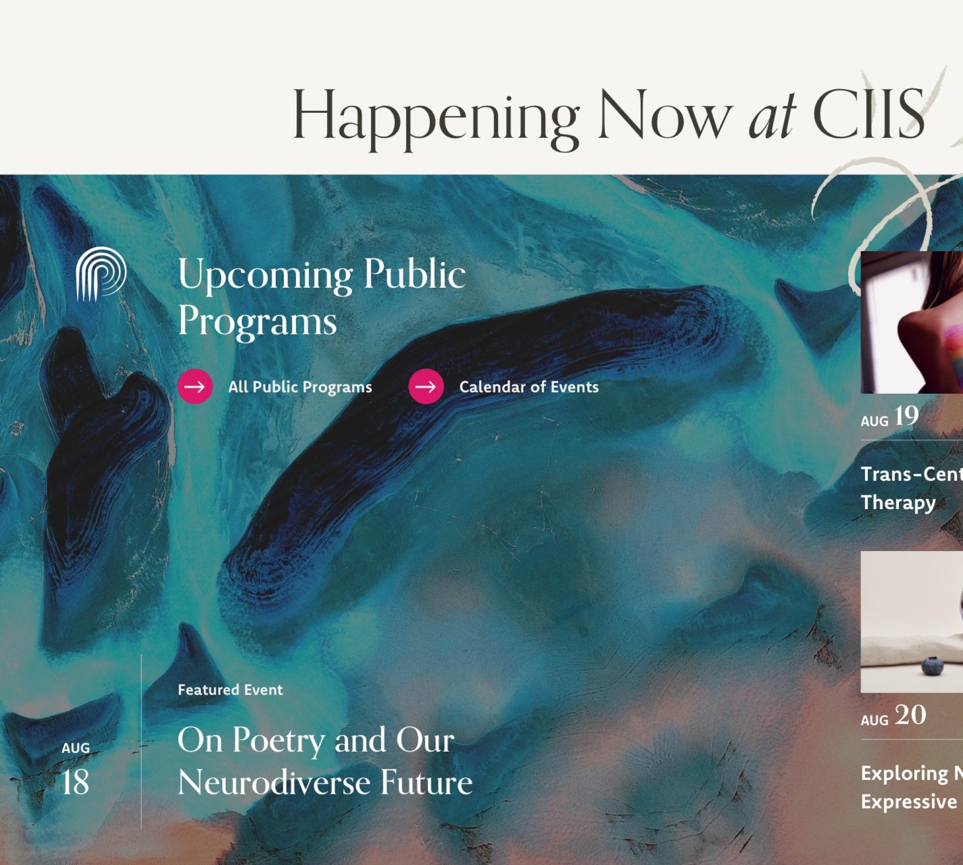
Formerly the institution’s sole logo, the mark scaled poorly in digital applications. CIIS asked us to find other ways to incorporate the symbol into our design. We chose to give it presence as an underlying texture across the site—it frequently appears ghosted in backgrounds, large and bleeding off the page.
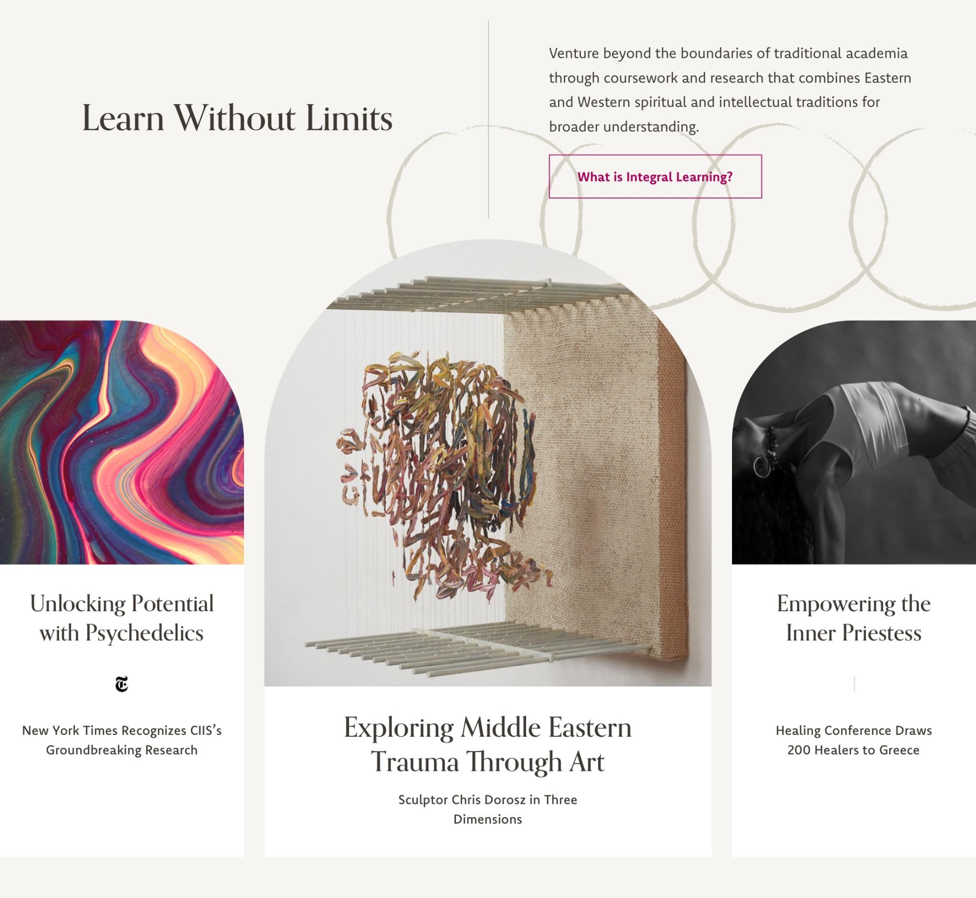
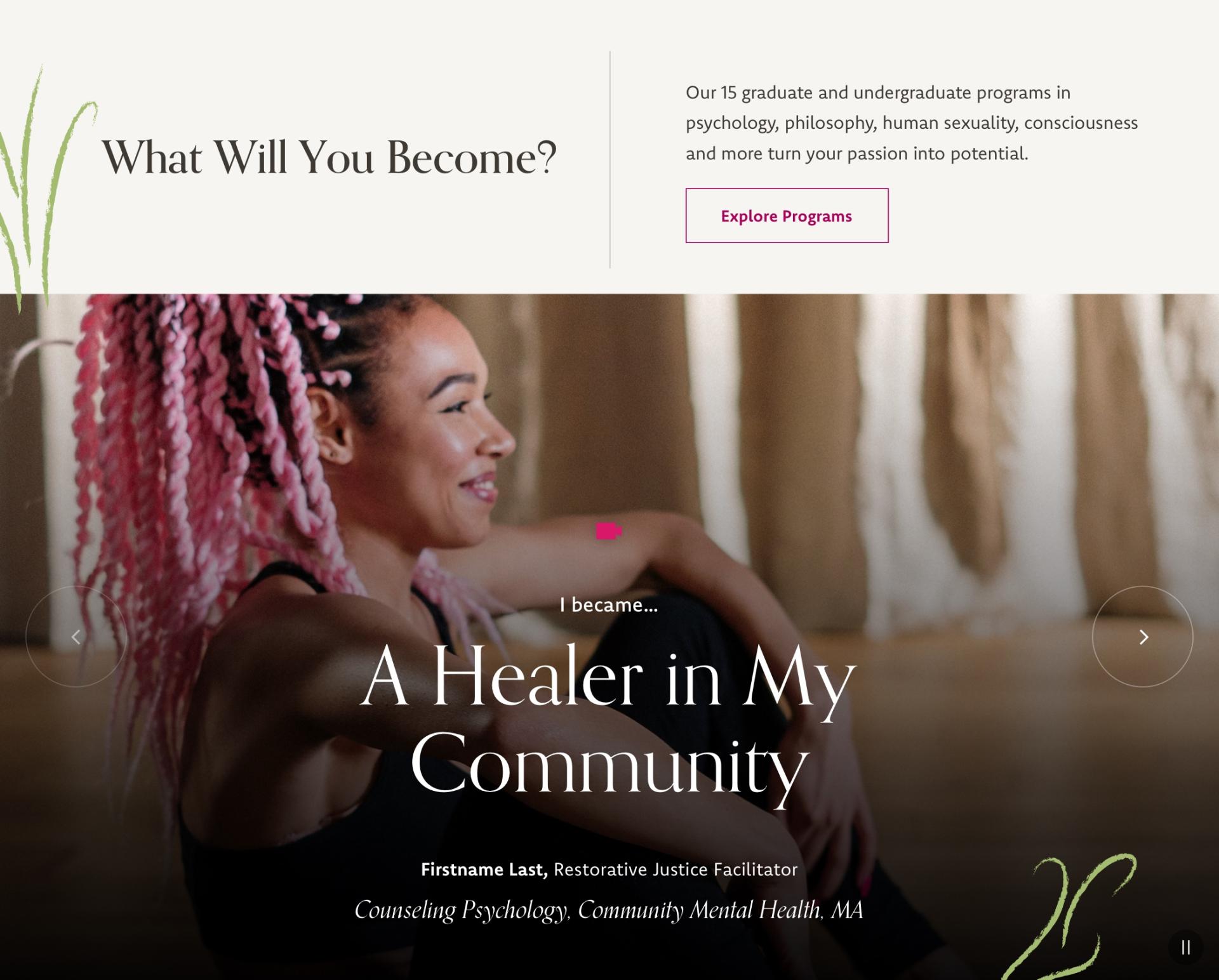
We also extended the brand through our web explorations with new typography and hand-drawn illustrations that add a human touch to the digital space.

Education Really Can Be a Journey
Many schools talk about the experience they offer students as a “journey.” At CIIS the journey is as real as can be. The school offers students a deeply personal academic experience that integrates mind, body and spirit. In a nurturing environment, students are encouraged to self-reflect as they explore beyond traditional avenues. We wanted to embed that sense of journey in the site through design, imagery and language.

Efficient Pathways Lead to Enlightenment
The school needed a digital presence that reflects its uniquely holistic academic experience, while emphasizing the intellectual rigor of its programs and the significant role the school plays in the wider world. It was also important to provide visitors with clear pathways to this information, especially as the site worked to position CIIS as a serious academic institution.
Adding Depth to Program Discovery
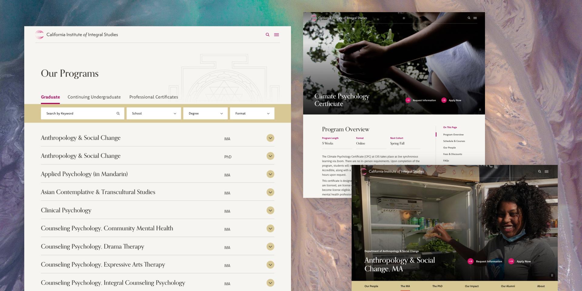
Highlighting CIIS’s academic gravitas started with showcasing the school’s unusual programs — many of which are in trending fields. The modern program-finder experience we designed lets prospectives easily browse offerings to discover programs that span Philosophy, Cosmology and Consciousness to Climate Psychology or Anthropology and Social Change.
Because so many of these areas of study are not widely understood, the program finder provides users with engaging on-page program information as well as linking to deeper dives.
Shining a Light on CIIS Scholarship
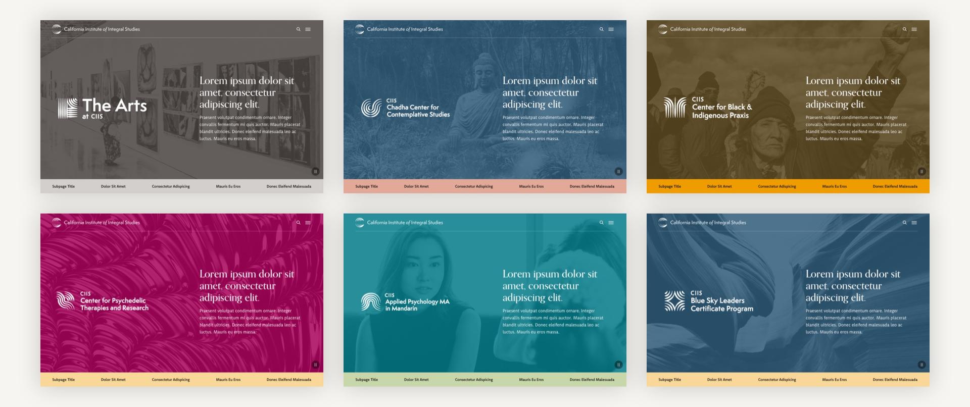
CIIS is a leader in the growing global discourse on holistic wellness and social impact, and is having a transformative impact on the Bay Area and beyond. By creating mini-site experiences for its seven important initiatives — many of them new — and a customizable color scheme tied to each sub-brand, the redesign has elevated initiatives like the Center for Black & Indigenous Praxis and Center for Psychedelic Therapies and Research, and helped create clear pathways for relevant audiences.
Providing for the Local Community
CIIS fosters a reciprocal, co-creational relationship between the University and those in its community. The school’s clinical outreach, via its community counseling clinics, reflect its spirit of sustaining the ones who sustain you.

And the Story Continues…
Prospective students have responded well to CIIS’s more modern and focused brand expression and website.

The site reflects the school's status as a leading academic institution with a curriculum that not only competes with, but exceeds that offered by traditional institutions — all while staying true to its beginnings.